Choosing a place to stay in a city depends on the accessibility to different facilities available. Is climbing stairs the only way to get to your home? How far is the workplace? What modes of transports are available? What shops are present in the neighborhood? How late will they remain open? Accessibility happens to be a significant factor when it comes to choosing, even the brands you subscribe to.
Email accessibility is a hot topic for the past couple of years, and the impact of having an accessible email on the average user experience has got most of the email marketers to sit up and give attention. Email accessibility is also one of the most misunderstood terms in email marketing. This article aims to teach about what email accessibility is and how you can reach out to new prospects while delighting the existing customer base with accessible emails.
What is accessibility and how are brands moving towards ‘digital accessibility’?
‘Accessibility’ is often associated with making daily interactions easier for someone with a disability of any form. The actual term ‘Accessibility’ refers to the universal design of an environment for people with a wide range of abilities to use products in a wide range of situations unassisted or with assistive technology. This means an inclined plane alongside the stairs makes the building accessible for someone in a wheelchair, using a walking stick or even for a person carrying a huge load.
When the principle of accessibility is transitioned into the digital realm, it governs the web as well as emails such that people can access them without relying on standard input devices, i.e. keyboard or mouse. Additionally, digital accessibility also makes people using assistive technologies such as screen readers, screen magnifiers, eye tracking systems, and advanced sip-n-puff devices navigate the web without hitting any user experience roadblocks.
How is an accessible email helpful in improving user experience?
An email that has a properly structured email layout, clear email copy formatting, and intelligent coding practices inculcated is considered as an Accessible email. When your subscribers can read through your emails with any hiccups, information transfer becomes very easy and engages them in a better way. An engaged subscriber will have increased user interactivity and motivates them to explore the brand more. The clarity in addressing the problem faced by them and providing a solution in the email itself helps in converting them faster.
Making small changes to your existing email campaigns such as keeping your CTA button in a contrasting color compared to your background color or adding appropriate alt-text to your images is taking a small step in the direction of making emails accessible. Let’s explore the different criteria for making an email campaign more accessible.
Transforming an email into an accessible email
As we stated earlier, adding an appropriate alt-text to your images and using a contrasting color for your CTA button helps to make an email more accessible. The benefits of doing so are:
- Most people tend to scan through the email copy, and the CTA button stands out as it is differentiated.
- Visually impaired people or those using screen readers can understand what image is conveying in the email from the alt-text.
- Even if the images are disabled in the email, the alt-text will act as the placeholder, and the email layout is not affected.
To transform an email into an accessible email let us breakdown the different elements of an email into three categories:
- Email Copy
- Email Design
- Coding Principles
Email Copy
An All-inclusive subject line: The first interaction a subscriber has with your email is with the subject line. An ideal subject line needs to communicate what the subscriber can expect to read the email. The length of a subject line is important as it affects anyone reading directly or with the assistance of screen readers. So, a subject line needs to be concise and self-explanatory.
Appropriate hyperlinks at the relevant text: Most email marketers have a habit of using generic terms as their call-to-action copy. Just as with subject lines, the call-to-action copy also needs to convey what the subscriber can expect on clicking the link. A generic call-to-action copy can be confusing for someone using a screen-reader, and that might deter them from clicking it. When you use actionable words such as ‘Start my 14-day trial’ or ‘Explore more designs’, not only do you convey what is the next action expected but also what would the subscriber be rewarded with, on clicking. Learn about the different CTA copy best practices and innovative examples.
In the example below by Wealthfront, the call-to-action copy ‘Open a cash account’ gives a clear context about what the subscriber can expect on clicking the links, and the link becomes relevant to the CTA copy.

Legible Typography: Typography involves the fonts used along with the line-spacing, font size, kerning, etc. Depending on the devices used, emails are generally read from a distance of at least 12-15cms. Having a font size below 16px would be difficult to read at such a distance and should be avoided for an email copy. The larger the fonts are, the easier it becomes to read, but then the email layout would be disturbed and so take an informed decision when it comes to the font size.
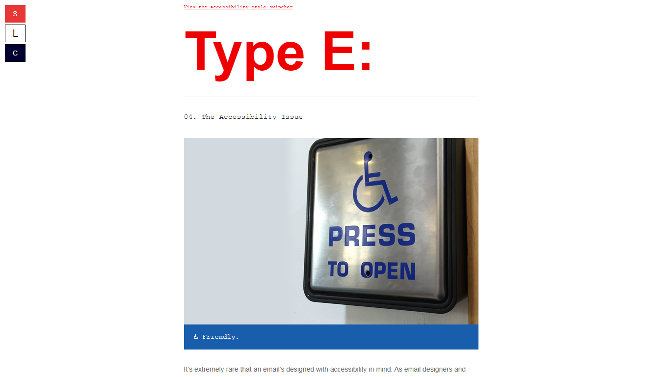
An email newsletter by Paul Airy titled Type E: follows the best practices of the font size. The newsletter carries an interactive way to enlarge the font-size of his email by adding buttons on the side. Additionally, there are controls to change the background colors of the emails.
Coming to the next typography aspect, i.e. the line length and spacing are also important when it comes to how fast a subscriber can read through it. Line length dictates how many words can be accommodated in a single line. The longer line length means the eye needs to travel far between each sentence, and this can cause fatigue. Shorter line length means constant to-fro motion, and this might cause dizziness. Additionally, with less space between each line, the subscriber may end reading the same sentence again and again. The animation below explains the importance of line spacing in a better way.
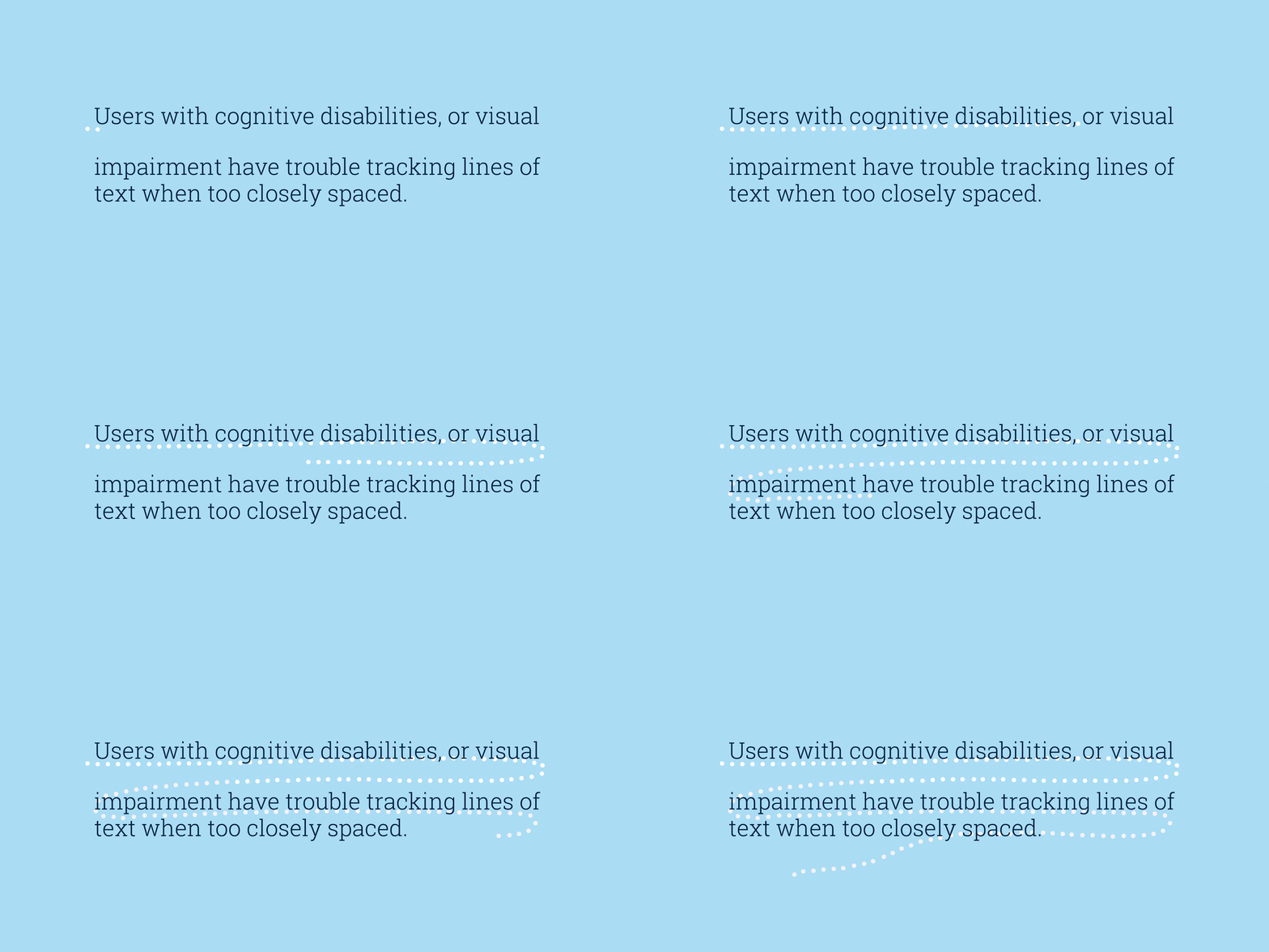
Ideally, it is a good practice to have 10 words in a single line and the line space is 1.5x the font size.
Email Design
Colors that counter Color blindness:Color blindness roughly affects 1 in 12 men, 1 in every 200 women. Quite contrary to popular beliefs, a color-blind person can see colors but, depending on the conditions they have, they cannot differentiate between certain specific colors. Color-blindness in people can be anyone out of the following three conditions:
- Inability to distinguish between red and green (Deuteranopia)
- Inability to distinguish between blue and yellow (Tritanopia)
- Complete color blindness (Monochromia)
So, while choosing the color scheme of your emails, they must be contrasting enough for a color-blind reader to differentiate.
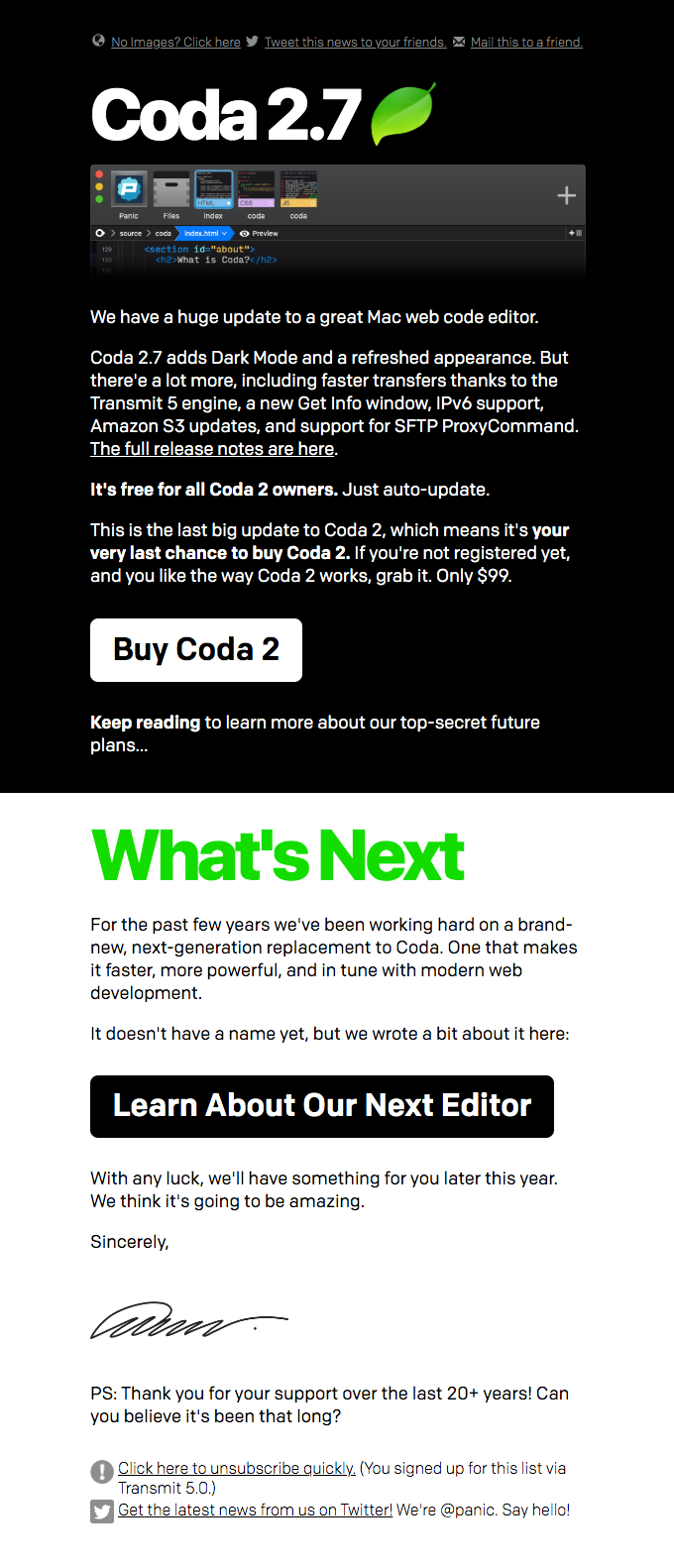
In the email example below by Panic, the color schemes are black and white with appropriate formatting as well as clear headings. Additionally, the occasional green heading breaks from the monotony well.
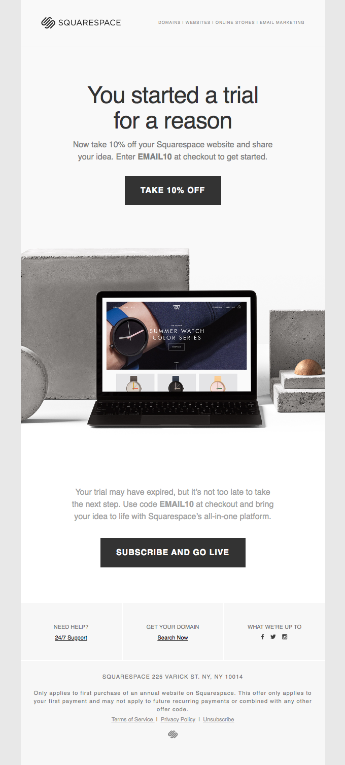
Breathable whitespace: Whitespace is to design what line space is for typography. Whitespace between two elements helps you identify each element individually. In a tightly crammed email layout, someone in a rush may not be able to distinguish anything and might choose to skip the email content. Whitespace between elements also helps someone with a reading disability to easily move from one section to another.
In the email example below by Squarespace, as you can observe, the elements are spaced enough that there is breathable space between each and the eyes are not tired when scanning through the images.
Have 80:20 text to image ratio: Having a relevant alt-text for the images in your emails is a good accessibility exercise. It defeats the email marketing best practices if your entire email is a single image with no text. Also, most ISPs tag such emails as SPAM, and this affects your deliverability. Learn more about how to maintain your email deliverability.
Easy to tap CTA buttons: Most emails are now opened in mobile devices, and if your CTA button is not big enough to be tapped a regular-sized thumb, your click-thru rates shall take a dip. Additionally, for those suffering from temporal motor-impairment (fractures or injury to hand) or permanent impairment can find it difficult to gain precision to click a button smaller than 44px.
Coding Principles
Assistive Device friendly coding: Emails are read on desktop as well as mobiles, but people may not be using mouse or thumbs to navigate through the emails. For those using keyboards should be able to scroll through your emails using the ‘tab’ key and clicking using the ‘space’ or ‘return’ key. Additionally, by adding the ‘role=presentation’ attribute to every table in your email, screen readers will read the content inside the entire table instead of individual cells.
Proper text formatting using semantic tags: Instead of having utter chaos with misaligned paragraphs, encapsulate your email copy in
tags. By making ample use of the heading tags from h1 to h6, you can introduce hierarchy to your email copy, and screen readers will read out the text accordingly. In the example below by Stripo, there are two sets of headings, and with appropriate heading tags, each heading is easily identifiable.

Now that we have understood the role of different email elements in making an email accessible, let’s understand how to test your email for accessibility.
How to test your email for accessibility issues
- Alt-text for images
Wave Tool and Google’s Accessibility tools can be used to disable images manually. Images without any alt-text will be displayed with ‘noalt’ attribute. - Keyboard accessibility
Use arrow keys on your keyboard to navigate through your email and shift across different links using the tab key. Does hitting return open the link? - Semantic Code
Using ‘inspect element’ in Chrome or any other web browser, check the code for semantic codes. - Does zooming break Responsiveness?
Zoom into your emails with ‘ctrl’ and ‘+’ combo or by pinch-zooming to check how far your emails be zoomed before it breaks. - Voiceover and Screen reader support
Use the inbuilt and popular 3rd party screen readers to check how your email is being ‘read.’
Wrapping Up
As you might have deduced, email accessibility not only for people with impairments but also makes your daily emails easy to read. An accessible email helps to build trust, significantly reducing your email unsubscribes, and this eventually helps you expand your customer base widely. Do you need help creating better accessible emails? Our QeInbox team of email designers and developers will make sure the delivered template is 100% accessible.

