Words have a huge impact on people. Some poetry can move us emotionally, a word of criticism can hurt us on many levels, while correctly framed statements can be the source of motivation. In fact, the power of email marketing depends heavily on how well you are able to convey the message in your emails. Additionally, the effectiveness of your email copy is tested based on how many subscribers are motivated enough to click the call to action.
Yet one of the novice mistakes that most email subscribers do, is sticking to the cliche CTA copy such as “Know More”, “Learn More”, “Click Here” or the most dreadful “Submit”. Similar to your subject lines, your CTA copy should also hint on what the subscriber can expect when they click on the button while being actionable. Thankfully, brands are moving away to explore CTA copies that aren’t ‘Click here’ or ‘Submit’ and this article shall showcase some of the email examples from brands that have unique CTA copies & explain the best practices while creating CTA.
“Learn about CTA”… not “Learn More”
Imagine you are invited to visit an upcoming restaurant in your neighborhood. The only information specified on the invitation is the name of the restaurant, the address, and ‘Visit Us’ at the ending; would you dare to visit? What if instead “Visit to Try the Best Sushi” was what was inviting you? The chances are, now that you are aware of what to expect, your decision becomes more clear.
Emails are like the above-mentioned event invitation, too less space to specify each and every detail without your subscribers losing interest mid-way. So you need to redirect them to a landing page that carries additional data by making them click the CTA button. Yet if you don’t communicate what the subscriber can expect at the landing page, paranoia will stop them from clicking. So, instead of using generic terms that seem actionable, use actual actionable terms that explain what to expect while staying actionable. To understand better let’s see some examples. The examples shown below are taken from ReallyGoodEmails, check them out for an exhaustive collection of emails for inspiration.
Slack

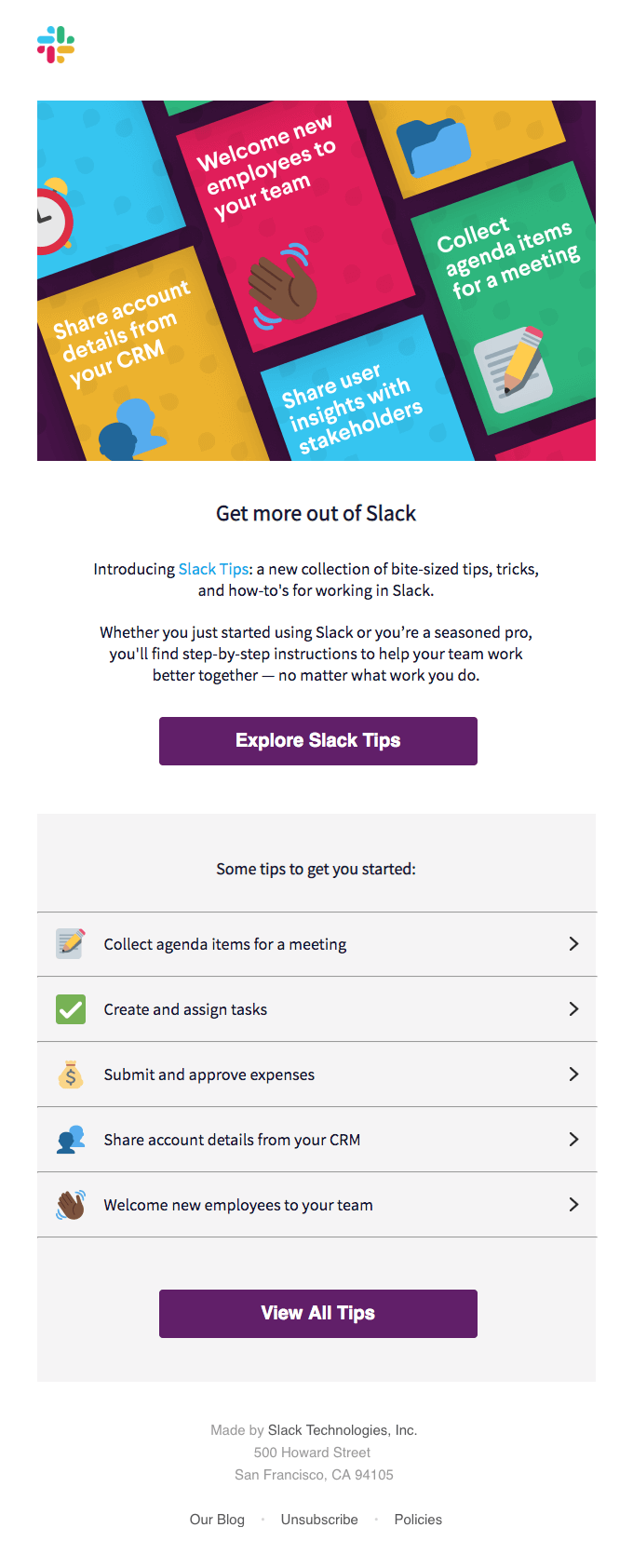
In the example above by Slack, the email talks about the different functionality users can take advantage of while using the app. The email copy starts with a general introduction about Slack tips followed by call-to-action that invites the subscriber to ‘Explore Slack Tips’. What is more interesting about this email is that the section between the two CTA buttons is a series of hyperlinks that redirect you to respective webpages making them inconspicuous call-to-actions. The email ends with another call-to-action button that drives the subscribers to ‘View’ all the tips.
Readdle

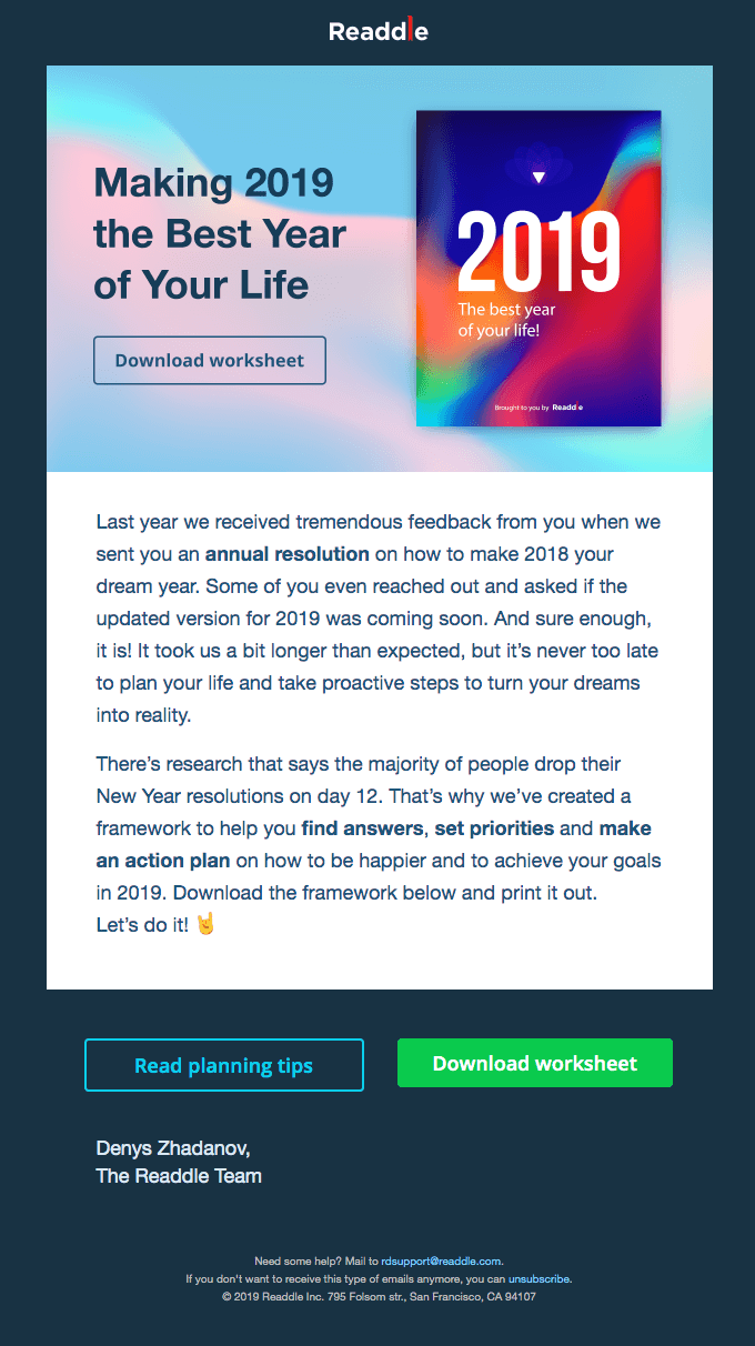
Productivity app development company Readdle, has a straightforward call-to-action in the first fold of the email. By looking on the image on the right, the subscriber gets an idea of what workbook they can download as specified by the CTA.
Frontier Flights

This reminder email by the Frontier Flights makes use of custom CTA for every individual task and stands on the point we are making in this blog. Based on the facilities provided by Frontier as well as those chosen by the user, the email has certain checkboxes unticked and the corresponding CTA shows what needs to be done. Quite well-designed email.
eMeals

In this New year’s email by eMeals, has the discount offer as the CTA copy. Why say ‘Click here’ when you can easily remind the subscriber they are getting 30% discount. Also what we liked was that the CTA is repeated.
Revelator

This new year throwback email by Revelator, is also a great example where they highlighted on major events that happened in the year 2018 and ended with a relevant CTA that says “Follow our work”. The way this email is designed, the subscriber would be intrigued to read further and the call-to-action matches the expression, greatly increasing the click-rates.
Call-to-action best practices
- Actionable yet self-explanatory text: As we stated in the entire article, the call-to-action should be such that your subscriber feels like taking the action in a way that they are informed what they can expect on clicking. But take care that it is short, concise and not…
- …not a sentence: Word length also matters. Instead of having a CTA copy “Try XYZ – Free for 60 days” you can make it concise as “XYZ for 60 days Trial”
- Placement matters: CTA placement is a crucial discussion that has been going on for ages. Many argue that by placing in the first fold, those clicking are taking a blind shot, while many contradict it by stating CTA placed at the end would go unnoticed. We believe that depending on the action to be taken, the CTA should be within the second scroll as any longer format email would be skimmed.
- Use a contrasting color: The goal of the CTA is to be clicked. But if the end user is not able to differentiate between the email copy and the call-to-action, then the efforts go to waste. So always have your primary call-to-action in the form of a button and have a contrasting color background for easy recognition.
- ‘My’ converts better than ‘Your’: Having a first-person CTA copy has proven to be more effective. Michael Aagard of Content Verve observed 90% increase in clicks when the CTA copy is written in first person view. The reason behind is that people are psychologically more moved when they realize that clicking the button shall benefit themselves.
- Sense of urgency: You want your subscribers to click the link and if you manage to create a sense of urgency in your subscribers, it translates into improved click rates. The same sense of urgency can be seen in the example above from eMeals.
- A/B test your copy: Even though your subscribers have remained subscribed to your brand doesn’t mean that you have figured them out. Experiment with the color, style, text, font to understand what works for your subscribers.
- Add a sub-text: A pre-header text is to explain further what you missed to communicate in your subject line. Similarly, you can add a sub-text to your call-to-action in order to explain anything that was left out. While this is prevalent mostly in websites, some of the brands are transitioning it onto the emails as well.
Wrapping Up
You may have the amazing looking email design, filled with interactivity, but if your subscribers fail to click on the CTA button, your efforts behind the email have been lost. While the error may be as insignificant as asking your subscribers to ‘Click here’ but your subscribers may not ‘click’ out of paranoia. We hope this article managed to give you inspiration and helped you improve your email marketing game. We constantly update the examples for you to remain updated, so bookmark this link.


