Planning your email campaign without having a valid email list is synonymous to driving a sports car at top speed on off-terrain; you will crash and burn before you can reach anywhere. An email list not only instructs the Email Service Provider (ESP) whom to send your emails but also helps you segment your subscribers into smaller lists based on the common interests and preferences.
Additionally, email list building is not a one-off activity as list churn (invalid email addresses and unsubscribes) will cut about 25-30% of the average email list every year (Source: GetResponse). So finding new list building sources as maintaining existing ones is a consistent activity as long as you wish to grow your brand.
This article will highlight on different ways on how to build an email list from scratch including offline as well as online sources that every email marketers need to know.
How to build an email list
#1 “Pop” up to show your offering:
Pop-up banners are the most common form of lead generation tactics employed by most email marketers. There are different ways to display pop-up banners on your website but the overall concept is creating visual distraction using a banner that is displayed based on certain triggers.
The most common types of pop-ups are
-
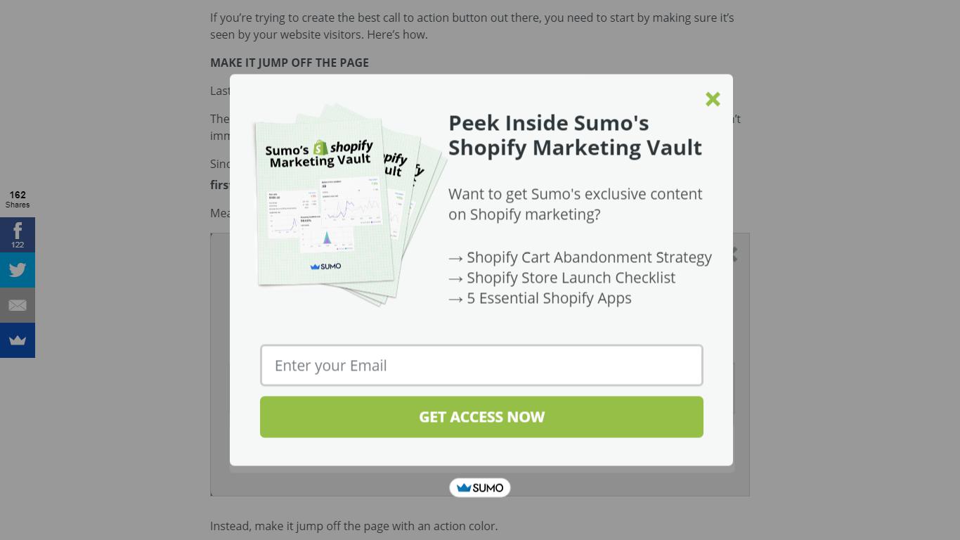
- Pop-up box: The pop-up box, as the name suggests, is a small box that appears in the middle of the visible portion of the website based on the trigger. It may feature an image, a small paragraph and a sign-up form depending on the ‘pitch’ or goal of the pop-up.
In the example below by Sumo.com, the pop-up banner is displayed when the visitor tries to exit the page.
- Pop-up box: The pop-up box, as the name suggests, is a small box that appears in the middle of the visible portion of the website based on the trigger. It may feature an image, a small paragraph and a sign-up form depending on the ‘pitch’ or goal of the pop-up.
-
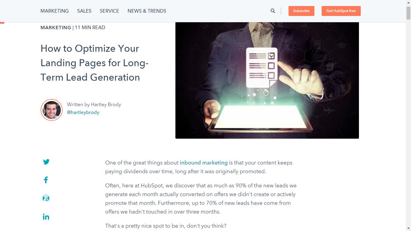
- Drop down banners: The least intrusive display banner that drops from the top or bottom of the website carrying a sentence followed a single field form (optional) with an actionable call-to-action. Being least intrusive, the chances of the visitors overlooking exist but this gives the most impressive user experience in exchange.
HubSpot’s example of the drop-down banner is displayed when the visitor scrolls down and remains sticky. This way the banner is sure to catch the attention of the visitor during the entire duration they are on the page.
- Drop down banners: The least intrusive display banner that drops from the top or bottom of the website carrying a sentence followed a single field form (optional) with an actionable call-to-action. Being least intrusive, the chances of the visitors overlooking exist but this gives the most impressive user experience in exchange.
-
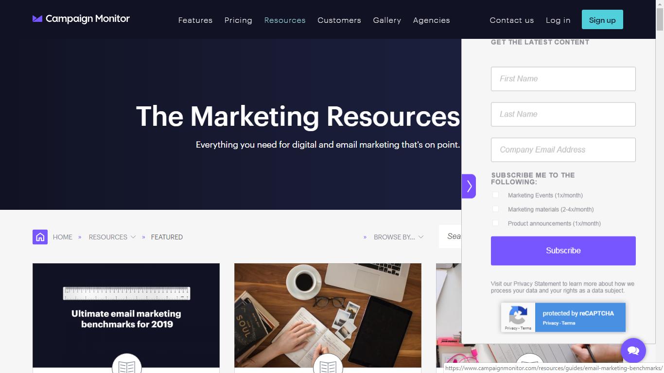
- Slide-in banners: These type of banners ‘emerge’ from either side of the screen and prominently displays without blocking the actual view of the visitor. Similar to the pop-up box, you can feature an image, a short paragraph, and sign-up form here also.
In the example by Campaign Monitor, the banner slides-in from the right edge in order to create enough visual distraction to suggest it’s presence.
- Slide-in banners: These type of banners ‘emerge’ from either side of the screen and prominently displays without blocking the actual view of the visitor. Similar to the pop-up box, you can feature an image, a short paragraph, and sign-up form here also.
-
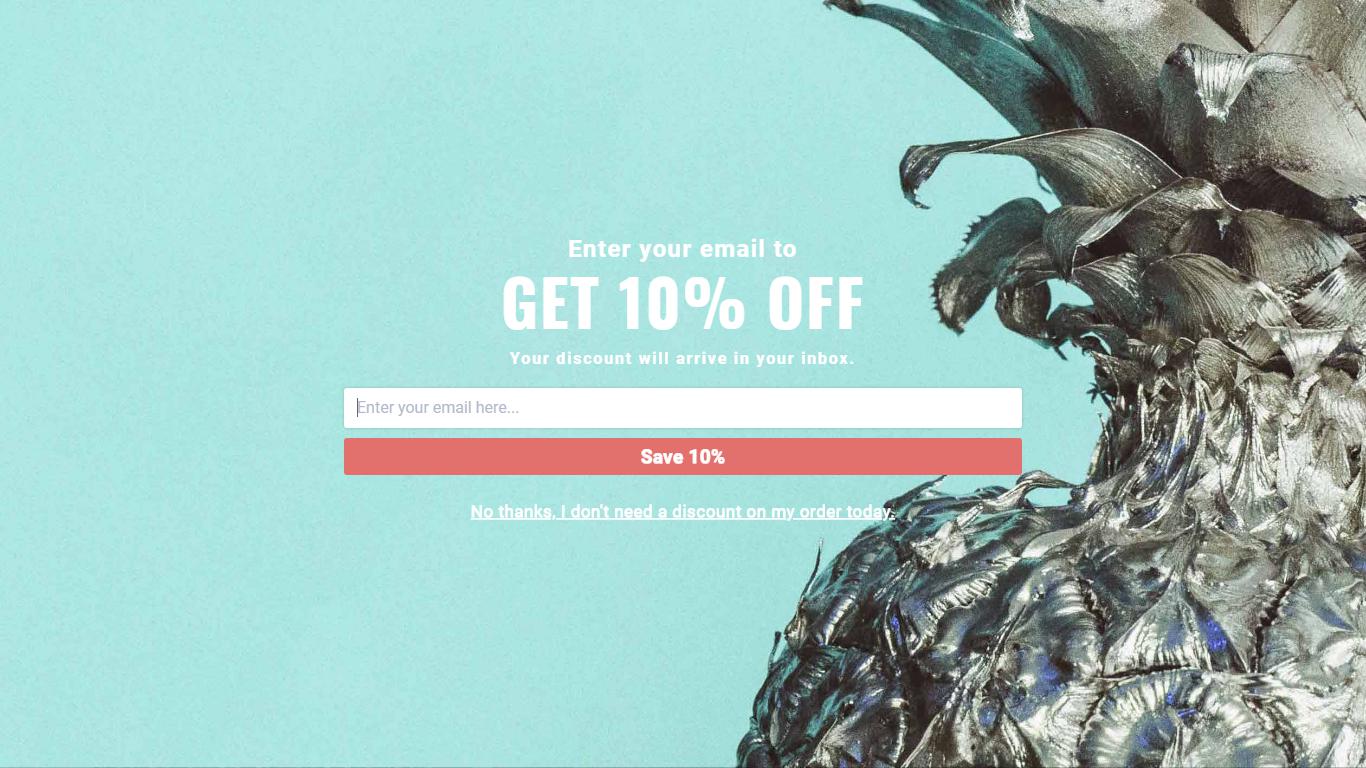
- Full page banners: The most obtrusive yet attention-grabbing version of the pop-up banner, this ‘hijacks’ the entire view of the website and continues to display unless interacted with or closed manually. Owing to the large screen space, you have to option to include more elements here but care needs to be taken to avoid clutter.
While visiting Sportique’s website, you are greeted by a full page banner that gets you a 10% discount on your first purchase.
- Full page banners: The most obtrusive yet attention-grabbing version of the pop-up banner, this ‘hijacks’ the entire view of the website and continues to display unless interacted with or closed manually. Owing to the large screen space, you have to option to include more elements here but care needs to be taken to avoid clutter.
#2 Feature Box
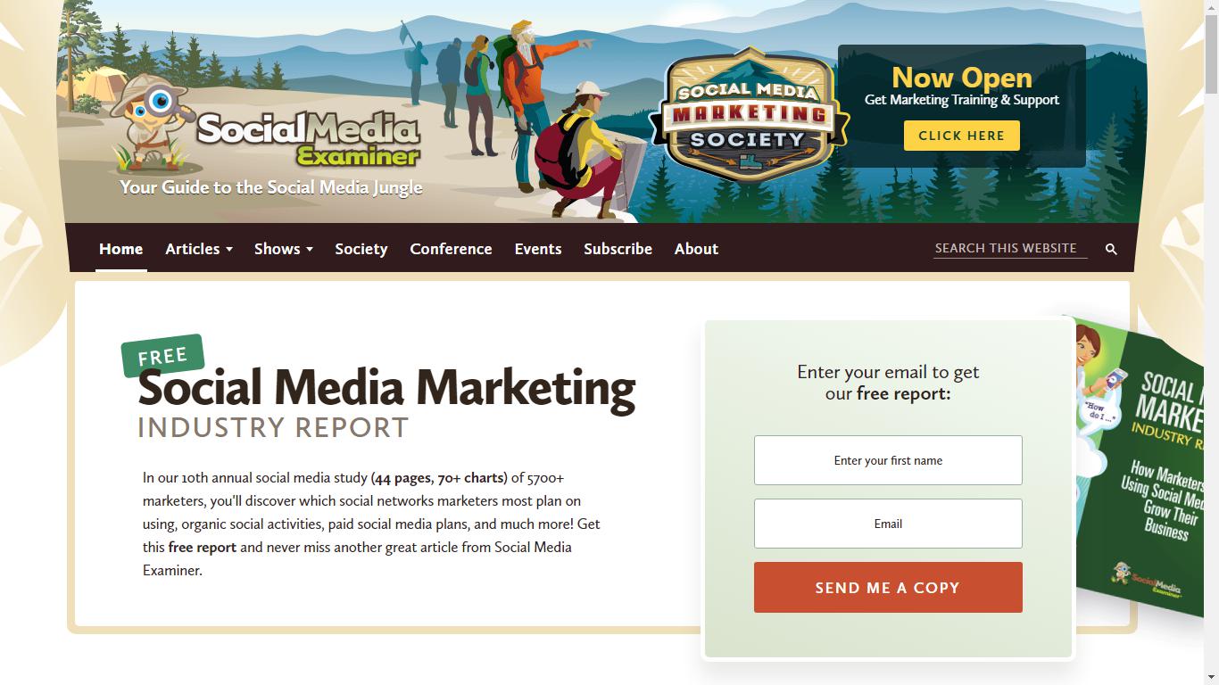
Alternate to ‘popping’ the banner, having it feature in the first fold of your blog page ensures that your visitors ‘see’ it. The feature box is a new marketing tactic adopted by marketers where the banner occupies a portion of the first fold and explains what your blog is about and how your visitors will benefit once they subscribe. Additionally, you can offer one of your downloadables or a free trial of your services just like done by Social Media Examiner in the example below.
#3 Relevant Landing Pages
Marketing is all about attracting prospects by offering exactly what they are looking for. Statistics states that having a different landing page for each target audience will help you gain more leads compared to having fewer landing pages for a common audience.
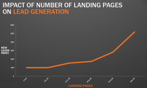
When you create a landing page whose sole purpose to accomplish one action – increase sign up, those prospects landing on that page will not be distracted with anything else. This way you ensure increased sign-ups.
#4 Multiple placements of call-to-actions:
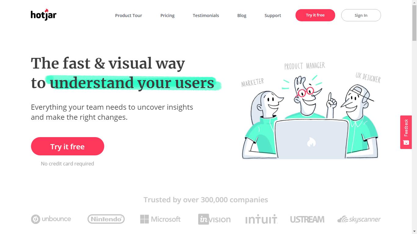
Ideally, 90% of those who read your headline will also read your Call-To-Action (CTA) (Source: Marketing Experiments). Placement of a CTA button has been the topic of discussion amongst marketers for years. One of the solutions to those conflicted about placing the CTA button in the first fold or footer of the page is to place the same CTA button at regular interval. This way, your visitors are periodically reminded about the benefits they stand to get by subscribing.
In the example below by Hotjar, the CTA is featured multiple times in the form of a sticky menu, a button in the first fold as well as before the footer begins.
Hotjar’s homepage (First Fold)
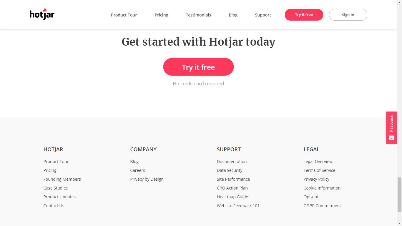
Hotjar’s homepage (Footer view)
#5 Free Downloadables
While there are no free lunches, people love it when you offer something valuable for free. Based on the inbound methodology, when someone visits your page, they expect you to provide solutions to their current situation yet not ready to make a purchase. In such times, having them subscribe to your newsletter in exchange for some downloadable is ‘Two birds with one stone’.
- You get them to be a part of your email list
- You offer them something that solves their current problem while building trust
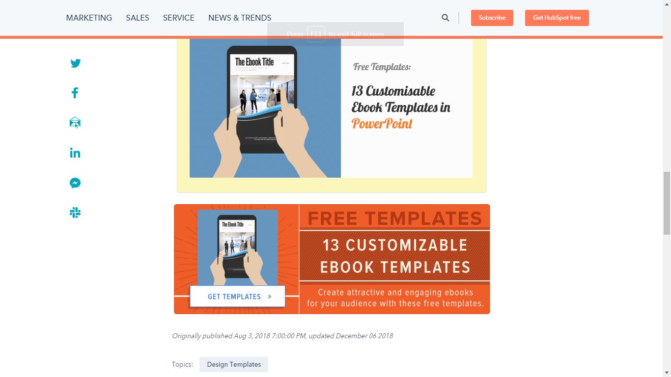
In the example below by HubSpot, when someone clicks the banner to download the eBook templates, they provide their email address in exchange of them.
#6 Social Media Sign-ups
Twitter and Facebook had humble beginnings as micro-blogging sites but now roughly boast of 3.2 billion users (Twitter) & 2.3 billion users (Facebook) globally. Utilize this user base to increase your audience base. Create viral content and promote on social media and target custom audience using social ads and promote them to subscribe to continue getting such high-quality content.
In 2017, Miami Dolphins did the same to gain 25 percent of new season ticket memberships and $4 million in revenue for the team.
They created a series of videos called ‘The Life’ and built a ‘engagement custom audience’ based on those who interacted with their content. Based on the collect audience demographics, Dolphins created Facebook Lead ads inviting their audience to sign up for various events or to receive information about tickets packages.
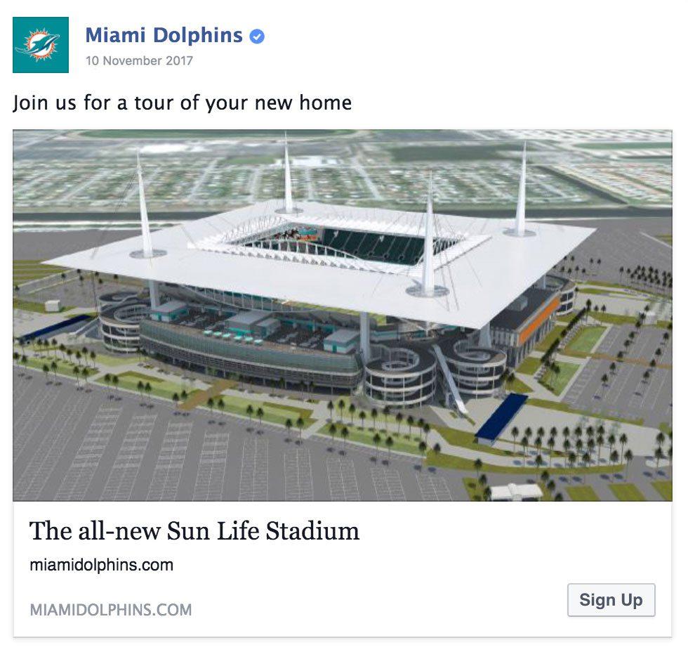
The lead ad posted by Miami Dolphins
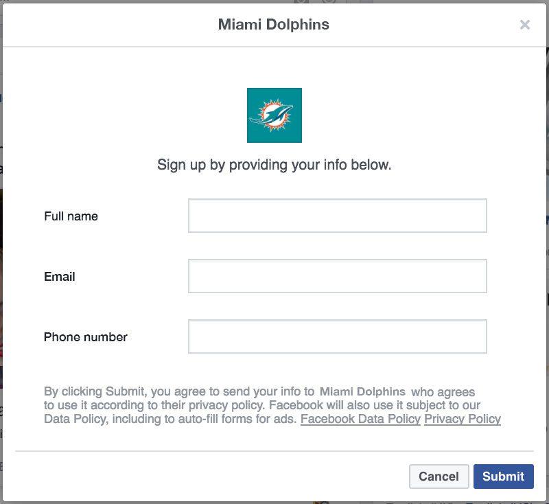
The sign-up form that people filled when they clicked on the ad post.
#7 Social Media Profile
Another great way to generate leads is to ask directly from your social media profile. All different social media platforms provide the option of adding your personal bio. By including a link to your blog home page or directly subscription form, you can convert most of your social followers in subscribers.
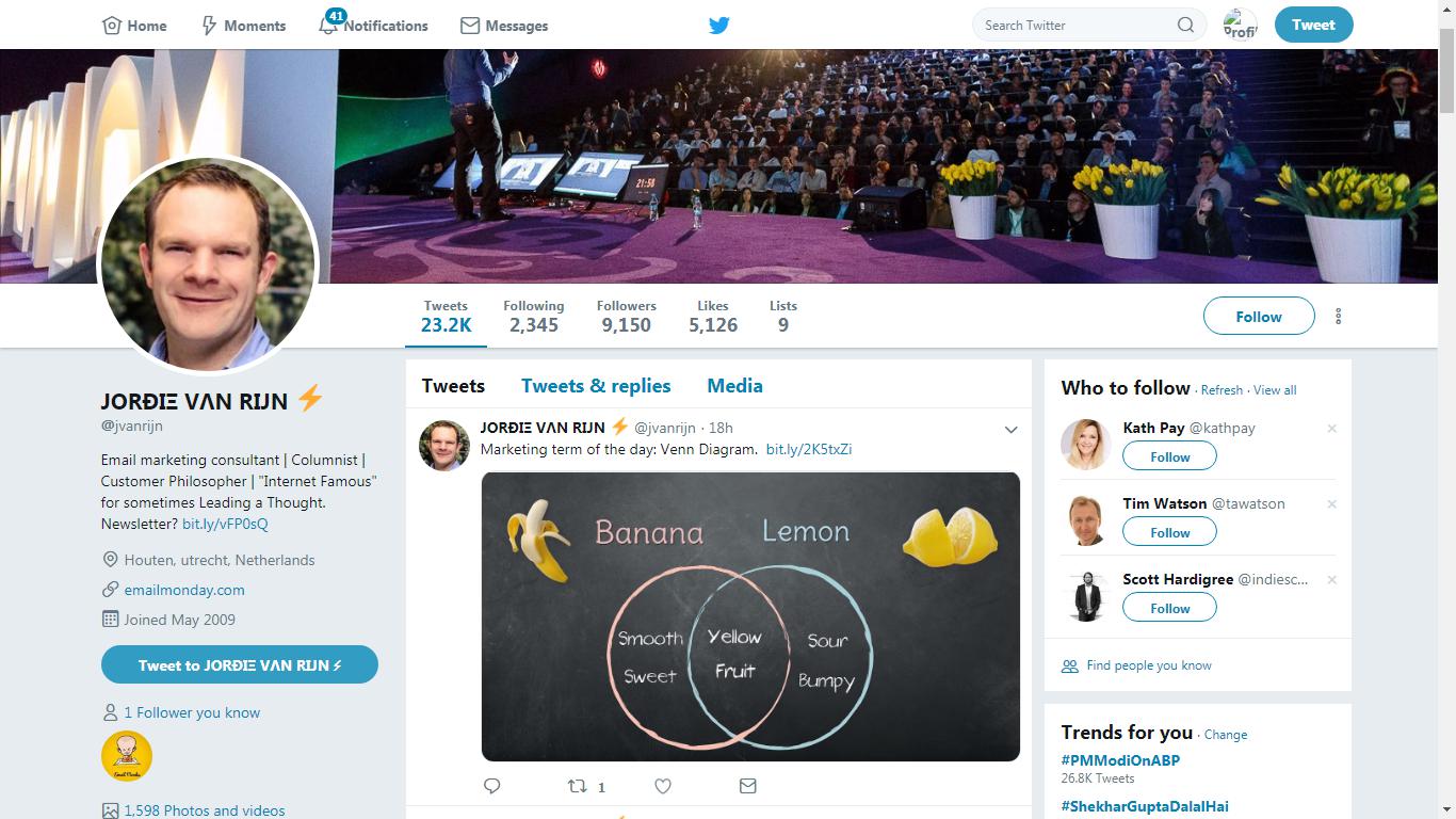
Jordie Van Rijn of EmailMonday does the same with his Twitter bio.
#8 Email Signature promotions
Similar to the aforementioned Twitter bio promotion, by including a link to your newsletter or sign-up as a part of your email signature, you can use emails as the bait to lure in more email address.
In the example below, featuring a recent content in the email signature also notifies the recipient of it. This way the visibility of the content is greatly increased and you subsequently increase your sign-ups.

Adding the link to your email signature can also help in the next idea.
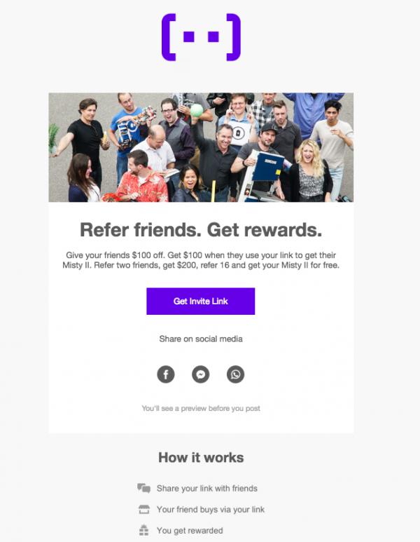
#9 Forward to friend & Referral Bonus
Leverage the contact base of your existing subscribers to further build your email list. By asking your subscribers to forward your shareworthy emails with their peers and contact list, you increase the visibility of your brands. Combine this with the email signature to get these new prospects to sign-up for your email newsletter. You tend to gain more email sign-ups from such word-of-mouth promotions compared to approaching such prospects directly.

#10 Gated Content
As Heath Ledger says in ‘The Dark Knight’…

When you have great and helpful content, don’t give it away. With the help of heatmap tools, observe the portion of your webpage, where most of your visitors interact and place a gated sign-up form at the point. This way, those interested would sign-up and you get a quality lead who is genuinely interested in learning more.
#11 Content Syndication
Content syndication is another great way to grab new eyeballs on your existing content. By syndicating your content on a different platform, you are re-purposing your content and increasing its visibility. As a rule of content syndication, the syndication platform needs to mention that the content was first published on your platform. This way those interested can click on your link and on landing can subscribe.
#12 Webinar Sign-up
Webinars are a boon for those who are geographically challenged to attend a physical seminar. By including a sign-up form to your webinar, you are not only collecting email address of your prospects, but also getting an email list of people attending your webinar.
The following 3 are offline methods to email list building.
#13 Sweepstakes
Everyone loves to win. When you conduct a sweepstake in which you accept email addresses of your customers, most will join with hopes of winning and getting notified via email.
#14 Brick and Mortar newsletter sign-up
By offering sign-up forms at the cash register or handing them out when your customers are shopping, you are utilizing the opportunity to remain connected with them digitally.
#15 Conference sign-up or card collections
Trade shows and Conferences are a great way to network with peers and prospects. Collect business cards and ask for permission to be mailed. If they agree, Boom! – You got a subscriber.
Wrapping Up
At the end of the day,
Amazing content + correct placement of notification + actionable calls-to-action = ever-growing email list
Having great content draws in the inbound traffic and you get repeat visitors. A timely reminder about providing a valuable incentive in exchange for their email address, you turn those repeat visitors into subscribers and are able to engage with them over email newsletters.


