Email started off as an interdepartmental communication channel that only supported the Unicode text. In the late 90s, email became a mainstream marketing channel and adopted HTML formatting. This opened up new opportunities for email marketers to beautify their promotional and marketing emails to draw their customers’ attention. Further addition of CSS animation by 2014 and the demand for responsive emails made email marketers put more emphasis on the visual attractiveness of their emails.
In this article, we shall look into the email design best practices and understand which email design impacts user engagement.
Things to focus on when considering email design
Most marketers tend to mistake email design to be using the correct images and colors in the email whereas email design involves everything from having the correct From Name, subject line & pre-header text placement, color schemes to even what you convey in the footer. The following list is the things to consider when designing emails:
Brand Personality
Your emails are an extension of your brand and the design needs to reflect it using your brand personality. Your emails need to have a conversation with your subscribers instead of just informing them. So, from the tone to the brand colors to how you sign off, your brand personality needs to be evident. A good brand personality also keeps your emails from being considered SPAM.
Pre-header & Subject Line
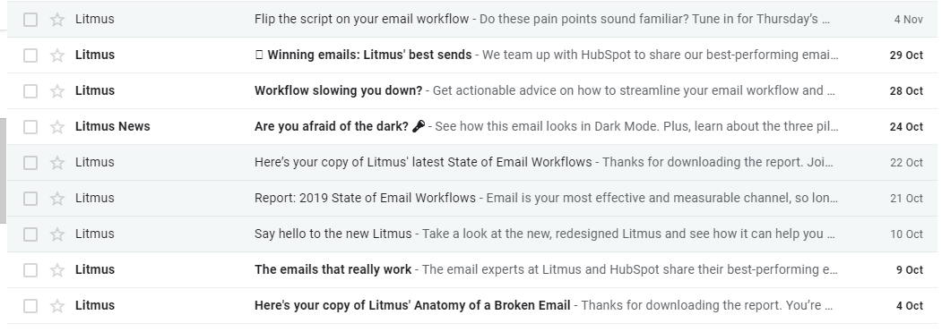
Email clients such as Gmail, iOS, and Outlook will display a small snippet of text from your email as a pre-header text. Most marketers tend to miss out on the opportunity in adding a personal flavor in the pre-header text. You can either use the pre-header text to complete something that was left out in the subject line or use it as an individual email element.

Litmus uses its pre-header to explain further what was hinted in their subject lines.

MailChart, on the other hand, uses personalization tags to make it more one to one interaction.
Email Layout
The email layout determines the placement of the elements in your email design. The email layout relies heavily on the visual hierarchy and you can have separate layouts for the same email depending on the screen width of the user’s device. Keep an 80:20 text to image balance in your email design for good user experience as well as avoid SPAM traps.
Accessibility
Accessibility is a baseline for any email design. While misinterpreted of only applicable to someone with a disability, accessibility in an email greatly boosts the user experience as well as makes it easy for someone to easily scan through the email while collecting valuable information. Read how to create an accessible email in our blog post.
Visual Aspect
Images are the pictorial version of your email copy and can communicate more while occupying less space. Any discrepancy in the visual aspect of email design such as stretching or blurred images can easily be detected by your readers and should be avoided with constant tested on multiple devices. Provide background colors and appropriate alt-text to all your images, use high definition but compressed retina-images to avoid image tearing or blurring.
Copy formatting
Not only is what you convey in your email copy important but how you convey it. A properly formatted email copy is a vital part of the email design. Copy formatting is not just restricted to short sentences, paragraphs but includes typography such as line spacing, line breaks, bullets.
Email Footer design
An email footer is where people sign-off but it is not only for that purpose. An email footer should include the physical address of the organization, contact details, reason why subscribers are receiving your emails, as well as the social profiles for them to engage with your brand on respective platforms.
Email Design Best Practices
Be Responsive
Even though it is 2019 and most people check their emails on handheld devices, marketers still do not understand the importance of creating responsive emails. Responsive emails adjust the email content based on the screen width of the devices. This can be the thin line between good user experience and an unsubscribe due to ruined user experience.
Use High Resolution but Compressed Images
As we stated earlier, using blurred or stretched images can drop the visual appeal of your emails. On the other hand, the more defined your image is, the larger will the file size be and longer it will take for an email client to download it. Opt for a lossless compression method to get optimum visuals without sacrificing on the file size. Additionally, use a background color and appropriate alt-text so that your subscriber can be engaged while the image loads.
While including images in your emails consider the following parameters:
- Image size: The file size should be as small as possible without sacrificing quality.
- Consider image width and height: When you specify the exact image size while coding your emails, you will maintain the structure of the email even when the images don’t load.
Have a color palette
Every color instigates a specific emotion within you. Red can convey urgency, blue can convey serenity, and green can calm you. But you cannot use colors as per your liking. Have a color palette where you can specify the brand colors as well as the shades that you are already using on other platforms and use them in your emails as well for consistency.
GIFs are still a thing
Animated GIFs are still a boon for marketers to fit in multiple images without affecting the screen length. You can replicate the feel of a video without exceeding the file size or coding headache of including an actual video. Ideally, your GIF shouldn’t exceed 1MB file size for the optimum experience.
Play with Fonts
Most email clients support system standard fonts such as Calibri, Helvetica, Arial, Verdana. Any 3rd party fonts can be used in your emails, provided that email-safe fallback font is specified for it. For those fonts that are too fancy for any fallback fonts, it is better to use them in images.
Place elements based on the eye-scan path
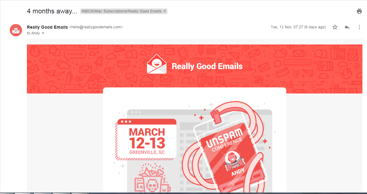
In every left to right reading country, the eye-scan begins from the top-left corner of your email and progressively narrows to the center. Hence, following an inverted pyramid placement, you make optimum use of the space by placing your brand logo along with any other relevant information such as sales announcements and call-to-actions in the middle..

In the example above by Really Good Emails, the top portion has the brand logo followed by a personalized image promoting their Unspam conference. The element placements emulate an inverted pyramid.
Design with Minimal distractions
The simpler your emails are, the easier it would be for someone to scan across and collect important information. Always follow a visual hierarchy while placing email elements in the email design. Avoid placing any distractions such as flashy GIFs or contrasting colors unless it is for the call-to-action button.
Always A/B test
You may not always have a finger on your subscriber’s pulse when it comes to email design preferences. It is a good practice to A/B test different elements in your email design for the effectiveness instead of assuming. Also, test your email design before sending to your subscribers.
Wrapping Up
The above-mentioned best practices are not commandments but more of a guideline for you to adapt to your existing email design and create your own style. Email design best practices constantly change and at the end of the day, what would matter is you find what works for your brand on the basis of testing, learning and implement the learnings. If you need help with innovative email designs, check out our template library or send an email to [email protected] for custom email design requirements.


