Every email ever sent is with the sole purpose of triggering sales. Be it a donation email, a service offer email, or a product display email, each of them competes to get an action! This is the reason why email call to action (CTA) is so very important. Appealing, unique, and intriguing CTA buttons in your email copies are hearts to your marketing campaigns. Being basic with a pinch of Bold is all you need to come up with email call to action designs that help in increasing the conversion rate.
The key point while drafting an email call to action copy is to keep it personalized and perfectly intended to the goal. You can also use behavioral marketing elements such as past purchase history, browsing pattern and more to make the CTA button and the entire email copy more targeted. Personalization is the key element, while for other email call to action tips and tricks, hop on our article journey. And do not forget, we are offering a few influential, real email call to action examples in-store too!
Email Call to action tips and tricks for email marketing campaigns
Email Call To Action Tip #1
The Button Text and Visuals
Be playful while you craft a CTA button in your email copy! Your subscribers are entertaining more than 100 other emails alongside yours, thus being creative is the only way out. Each word in email copy is vital, but an out-of-the-box call to action will draw the attention which may lead to action. Lookout for the visual cues with great and catchy color combinations, font, graphics, and overall template.
Moreover, give a pass to common CTAs such as Sign up, Read more, Click here or Browse more. Think as a subscriber and write things that can make you click that button. Compelling copies are recognized everywhere!
Example – Take a look at litmus.com’s email newsletter where they’ve put multiple CTAs with varies intent and button text. They’re on-point with whatever they’re offering and haven’t used a single call to action that’s common or repetitive. Litmus has put all its offerings in a single email campaign yet wins the show with catchy graphics and unique CTAs. Take a look…

Email Call To Action Trick #1
Link Images To Landing Pages
The images you use in email copies play an important part! People are more likely to click on the images than any text. This being the reason, it is important to provide a redirection link attached to your email images. Later on, when the landing page opens up, make sure you use CTAs that encourage them to take action. Creativity wins here too! Implement text which is hard to resist. Free, explore, etc. words encourage users to click.
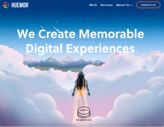
Example – Below is a landing page example by Huemor which has a very eye-catchy appeal to its text and graphics. They’ve played with human emotion where people are triggered to do what is asked not to. The CTA is placed at the phrase ‘Launch’ with a small undertext ‘Do not press’. Now be honest and decide what you would have done if this was encountered by you. Take a look…

Email Call To Action Tip #2
Make the Email Call to Action Interactive and Add Directing Cues
Whenever you put CTA in your email copy, keep in mind using words and sentences that directly talk to the users. Place the phrases as if you’re conversing with them. Apart from this, use arrows or direction that indicates clicking on CTAs. Successful email marketing campaigns are made of Open Rates, Click-through Rates (CTRs), and Conversion Rates (CRs), and CTA plays a great part here. You can add FOMO (fear of missing out) and sense of urgency CTAs that implies taking action within a stipulated time.
Example – Take a look at Rawpixel – a stock image platform’s email template where they are directly talking to users to take action.
![]()
Email Call To Action Trick #2
Preview Text CTA
One should always keep in mind that email copies have the shortest attention span from the users! People check their inboxes quite often but they do not always open each mail. This is the reason why brands struggle to get the desired open rates. The catch here is to utilize the preview text area! Email marketing campaigns should invest their time in writing enticing subject lines, preheader texts, and CTAs – this is undeniable. But, an important trick to get your subscribers to open your emails is putting a Preview Text! Yes, you can have different preview text, preheader text, subject line, and email body text. Make the most out of ‘This’ area in your emails and put up a CTA that encourage the users to open your copy.
Example – Take a look at below two images of the footwear brand Crocs. One has the preview text CTA to it and the other one is the received email template.


Final Tip And Trick For Email CTA
Email call to action buttons are major attractions and should get all eyes! Place it at the most prominent places in your email copy to get the clicks. Another important aspect of marketing emails is their signature. CTAs in email signatures are strong conversion measures! Putting up any extra links such as social sharing and follow buttons, webinar signup form, store details, eBooks, etc. should be kept here for a brief notice. This helps to improve the traffic to your other channels. You can design separate landing pages for these with your primary domain to get the link juice too. If you’re looking for designing specific landing pages, QeRetail can help you with the same!
Example – Following is an email template from Disney, which is a great example of how one should optimize their email signature. They’ve provided store locator, social follow buttons, and more at the end of their email.

Over To You
Email marketing campaigns are essential for conversions, and people love receiving interesting email copies from their preferred brands. Provided, your email should be mobile-friendly because a significant rise in mobile email users is noticed the last year. And, iPhone is on #1 with 28% of email client market share. Catchy email call to action is the heart and soul, thus above mentioned email CTA tips and tricks should guide you for your next email marketing campaign.
If you want to audit your email template for better deliverability and test it, go to QeInbox’s website. We offer many other email marketing campaign services too!


