We love to remain updated with whatever catches our interests. Be it movies, fantasy football, recipes, or even latest fashion, every one of us has subscribed to a newsletter, either in physical or digital form. With the booming growth in the handheld devices flooding the markets, emails have become the favored medium for receiving newsletters. Yet, most email marketers tend to see an email newsletter, a league different from the promotional emails and fail to charm their subscribers.
This article is a beginner’s guide to creating an email newsletter, along with a few best practices and examples from brands.
Significance and Effectiveness of Email Newsletter
Most of the time, a first-time visitor on your website comes with no intentions of making a purchase. They may check out your homepage, a couple of service pages, and (thanks to a timely pop-up) subscribe to your emailing list. The act of subscribing is an indication that they are interested to know more about your products, and on finding relevancy to the problem they currently face, would love to make a purchase.
The scope of the newsletter doesn’t end after a purchase. Your customer may be using your products/services but needs further information for efficient use. Your newsletter can carry useful tips or guide for your customers to refer in order to fully utilize your products.
Just like promotional emails are present to inform the subscriber about any upcoming sale or promotions, email newsletters take over the responsibility of ‘nurturing’ or educating the quality leads. Your email newsletter can be any type of educational material such as guides, blog posts, news, reviews, tips, or other resources. Your email newsletter is a great way to increase traffic to your website. Also, compared to other forms of marketing, the cost of an email newsletter is comparatively lower and the ROI is higher compared to others.
Email newsletters are very much effective to keep your customers engaged and the following are some statistics that confirm it.
- 83% of B2B marketers use email newsletters for content marketing. – Content Marketing Institute
- 40 percent of B2B marketers say email newsletters are most critical to their content marketing success.
- The average open rates for an email newsletter across different industries is 20.81%. – MailChimp
- Companies who send automated email newsletters are 133% more likely to send relevant messages that correspond with a customer’s purchase cycle. – Lenskold and Pedowitz Groups
- Segmented and targeted emails generate 58% of all revenue. – DMA
- 81% of online shoppers who receive emails based on previous shopping habits were at least somewhat likely to make a purchase as a result of targeted email. –eMarketer
Guide to creating your email newsletter
Step #1: Find out what your target audience is looking for
People subscribe to those email newsletter that interests them and keeps them updated with the latest information about their interest. Before you work on your email newsletter content, it is important for finding out what drew them to subscribe to you. Analyze what product categories did they check out before subscribing. Add options in your sign up form that your subscribers can choose. By pre-segmenting your customer base on the basis of their preferences, you are not only getting content ideas but also you are ensuring that your subscribers only receive the news that they want.
Step #2: Decide the frequency
The goal of a newsletter is to capture the attention of your audience by providing valuable and engaging information. Sending a newsletter for the sake of it won’t cut it and will lead your subscribers to either be disengaged or even unsubscribe. So, always stick to a sending frequency that provides you with enough data to make your subscribers anticipate for your newsletters. Ideally going for a weekly or a bi-weekly is an ideal time gap.
Step #3: Creating your email newsletter
The first and foremost things that people notice when they open a newsletter is the design. As we stated earlier, it is unjust if your promotional emails have all the bells and whistle but your newsletter looks like a newspaper from the 1950s. Making your newsletter visually appealing doesn’t mean that you need to add streamers and festivities to your design but arranging the elements in a way to attract attention.
One of the greatest ways to increase the visual appeal of your newsletter is to implement visual hierarchy. By arranging the content in your newsletter in a layout that aids popular eye-scan paths such as Zig-zag, ‘F’ layout, ‘Z’ layout or columned layout, you manage to pass on the information based on the subscriber’s pace.

In the above example, the newsletter starts with a short note from the sender followed by a compilation of curated content arranged in ‘F’ pattern layout
We have featured some of the email newsletter designs that managed to capture our eyes (and hearts).
Step #4: Don’t promote everyone at the same time
In conjunction with the earlier stated about visual hierarchy, you may have multiple contents that you need to send to your subscribers. Yet need to prioritize which articles do you need to feature in your newsletter and which to be shown when the subscriber lands on a dedicated page. This is especially applicable when you have the same products or services under the same category. E.g. Clothing, Home decor, Automobiles, etc.
Step #5: Reveal enough to intrigue
Emails are restricted by the amount of content you can include before losing the interest of your subscribers. So most email marketers tend to write a small excerpt about the different stories followed by a call to action that redirects the subscriber to the appropriate landing page. This is a genius move owing to two factors:
- You reduce the overall length of the email without compromising on the overall content quality
- Not every article you feature in your email newsletter will interest all your subscriber base. By tracking the clicks on individual call to action buttons, you can make an analysis of which topics get more traction
Step #6: Be responsi(ve)ble
With the exception of B2B email newsletters, most emails are read over the mobile devices. Add to it the factor that email newsletters tend to be content heavy, it takes time for someone to skim through the content easily, especially on a smaller display. So, to avoid any bad user experience, always create responsive email newsletters that render no matter the dimensions of the screen.
Email Newsletter Best Practices
- Best Sending Time = Your target audience: Like countless other articles as well as email marketers may have said, the best sending time for scheduling your email newsletters is when your subscribers are more active. For B2B newsletters, the emails are most read during the working hours of weekdays. For DIY hobbyists, your emails may be read mostly during weekends. Analyze when your website receives the most number of visits during the entire day to guess the suitable time.
- Give a preference: Times changes, purposes change and with the changing purpose, the interest level of the subscriber may change. Always include a link to your preference center in the footer of every newsletter where it is visible to your subscribers. This way you can significantly reduce the number of unsubscribes owing to preference changes.
- The newsletter can be promotional but to an extent: An email newsletter is read prone to be read than a promotional email for a reason. They are educational in nature. Yet, you can still introduce a bit of promotion in your email newsletter as long as you don’t make it obvious. Maintain 90-10 ratio while including promotion along with your information.
- Start a story with the subject line: The subject line is the key to the door of doubt in your subscriber. If the key manages to unlock, only then will your subscriber view rest of your email newsletter. Make your subject line interesting enough to act as a hook for your subscribers but ensure it sets up the correct kind of expectation. Hint upon what they can expect to see when they open the email.
- Always archive: Email newsletters are not one-off communication modes that serve no purpose after months of sending it. Always link to earlier newsletters for your subscribers to refer in case they joined late or missed receiving it due to any reason.
Email Newsletter Examples

In the above email example by CarKeys, each section has a prominent image, followed by a short write-up fetched from the article itself followed by the call-to-action.
Even though they featured two call-to-action, the color scheme maintains the visual hierarchy

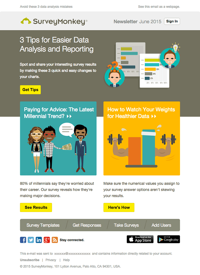
This email newsletter by SurveyMonkey has a straightforward design with easy to follow element arrangement. Additionally, the call-to-action copy also speaks what the subscribers can expect when they click it.
Read about brands whose CTA isn’t ‘Click Here’.

The above email newsletter by WePresent is a colorful one without multiple image styles to break the monotony.


